Animation has become hugely important to brands and the way they use it within the digital space. It can be made easier to design for if the animation is broken down into 2 areas: Functional and Personal.
I can't tell you how many brand books or guidelines I've seen over the years that think within their "digital" section it is enough to mock up a site or app with their logo on it or even just convert CMYK to RGB values. I mean, thats all us digital designers need right??
It might be music to a Digital Designers ears to see guidelines that allow such freedom, but it could also allow any other agencies who design digital assets for the client to feel they have the freedom to creatively flex the brand. This could mean you have three or four (or more!) different agencies coming at the brand guidelines from different directions, resulting in a very confused and incoherent brand.
Brands have to be aware of their assets in the digital space now more than ever with platforms growing and, in some cases, pixels getting even smaller. From TV to desktop to the smart watch your brand must have a digital presence without interfering with the users overall experience.
I believe some brands are accepting digital with open arms and really harnessing every opportunity it has. I don't just mean this in the advertising sense or by using platforms such as Facebook or emerging apps like Periscope in some unique way, I mean it from a branding point of view. If you look at all of the brands we know and love and use/see most days (if not every day), they are full of little UX, interactions, fonts, colours and language that we start to intuitively love about the brand or product.
Personal & Function
Brand animation can be broken down into two areas: Functional & Personal. Functional motion is simple and intuitive. It helps guide the user with contextual animations, making interfaces easier to navigate and more engaging. Below are some great examples of functional animation helping and guiding the user throughout their experience and animation that should be the norm.
Below we have a transition showing input title's that animate up and above where the user is typing. This allows the design to be clean, direct and functional.
Below is an animated submit button that seamlessly transitions from a button to a loader and then to a confirmation icon. Great example of a button working harder as piece of communication. This also keeps the users eye line in one area and not flying around the page to double check what they've sent has gone.
Below is a search bar that transitions from a button to a input field and then delivering the user with their search term results.
Below you'll see a simple next and Back button that activates a page transition. If you're anything like me and get frustrated waiting for a page to load or notice that parts of the page you're going to load all over the place and not in order this technique is a lovely execution.
Brands with bags of personality
Personality is an area for the brand to express itself, it can be fun, playful an expressive. It is also an area to to help pull itself apart from other brands.
Brands with personality like Skype take ownership of words like ‘bubble’ in every way. Their logo is full of bubbles, their sound effects make you feel like you are under digital water and their animations, from opening the app to making a call, exude the word. This animation gives the feel of a friendly, playful, fun, interactive, approachable brand that also makes the user smile and it allows the user to emotionally engage with the brand on another level.
Below is a simple loading animation that showcases the personality of the brand in simple and elegant way.
Skype loader animation
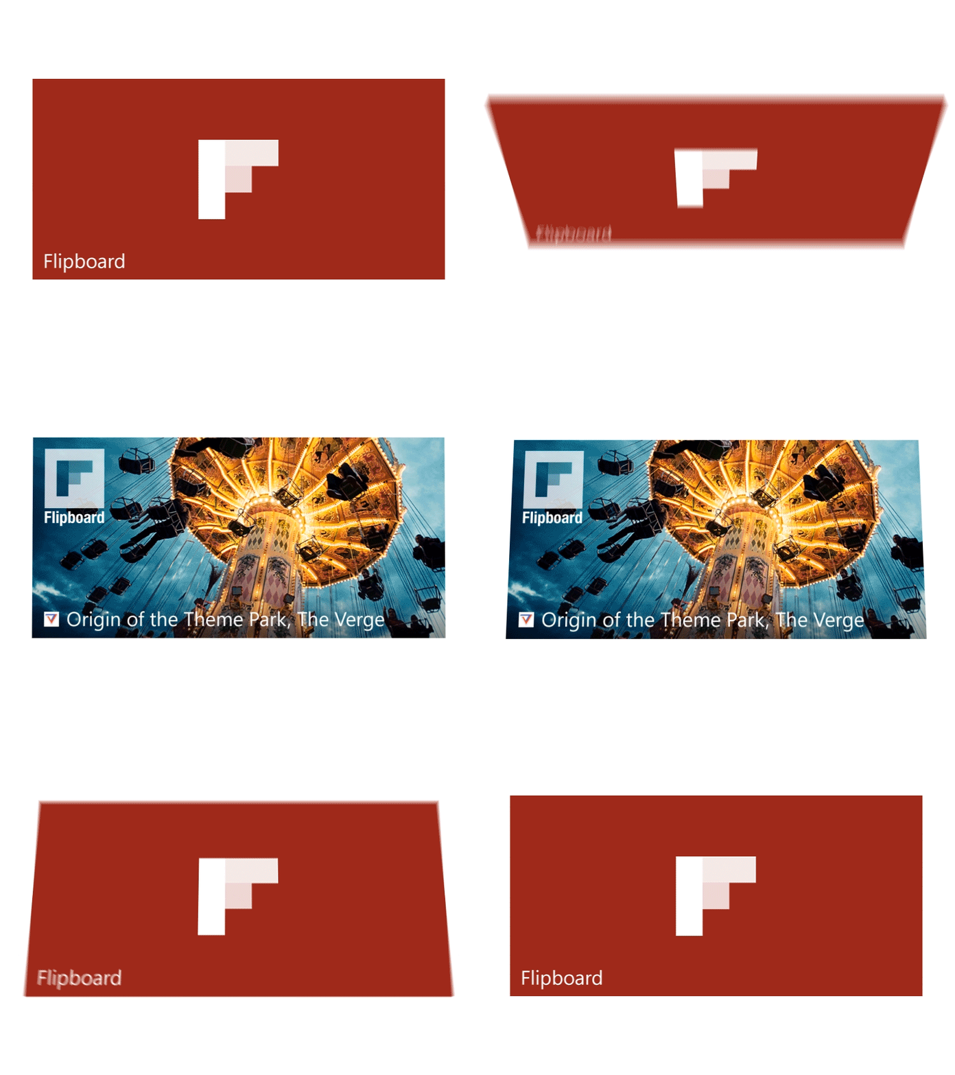
Flipboard is another brand that owns the animation territory of ‘flip’. From their name to their logo design to the way you interact with the app, it uses this word to give the brand personality and individuality. My only issue with the brand is that when launching their site https://flipboard.com/ they forgot about the animation, which makes it feel like any other site and, for me, left it with no personality at all. If it wasn’t for the logo in the top left hand corner you wouldn’t know it was a site from Flipboard, which is such a shame from a brand which has such a great piece animation that you are already recognised for. If you've got it flaunt it!
There are lots of helpful/inspirational sites that also give you open source code you can use on your brand or project to lift the animation and see what's possible from a development perspective. Here is one I find pretty useful. (Nightmare to navigate but just enjoy flicking through) If you're going to own a territory like they have then just go that extra mile:
http://tympanus.net/Development/3DGridEffect/index2.html
Another brand I've also had enough of but is a great user case of owning all aspect of digital is Google with their Google Material
Google do a great job of giving their guidelines a direction and a metaphor that is inherent in everything they do, even if it feels a little post rational it works as a hinge for everything to fall off the back of.
How do you get to a single animation that a brand can use?
Functional: There are the obvious decisions to make first, like what rules does our base animation style follow? Not all of your animation is going to be oozing the brands personality. Your first level should not overpower the content on the page, feel forced or interfere with the users journey. Make it intuitive, simple and easy to understand, there shouldn't be any extra fluff or complexity. For want of a better analogy, no one likes the dude at the party that just wants to get drunk and talks crap all night, at some point you'd like to talk a bit of sense.
Personality: As I said before, this is where you'r going to add the most value so it's a good idea to brainstorm words that reflect the brand like energy, powerful, friendly, approachable or serious, calming, empowering, relaxing and responsive. Then start to develop a mood board that reflects these words. By doing this you should now start to see elements on the screen that you can translate into a movement in some way shape of form.
Below is an example of a mood board that can be translated into a movement using the word Liquified.
The ability to tell stories with transitions and subtle motion-based animation are skills that must be embraced to produce to produce great work.
Well considered motion in interface design can help guide, provide context and delight users. Animation offers the opportunity to surprise, making applications more enjoyable and engaging.


